It’s taken me 3 years, but Theologica has finally been submitted to the App Store and is waiting approval. I’ve learned a lot in the process about not only app architecture but also about the “efficient hermeneutic” of design: every UI choice communicates a message.
I first had an idea for a “Theology app” during my first iOS development class at Noble Desktop in NYC. Our tutorial included a simple “band app” that used a table view to display information and YouTube videos about 4 different bands in Brooklyn. At some point, I noticed that the app didn’t include a back end at all and thought I could use the same template to build an app for my department and students to use. That’s how it started.
Originally, it was only a dictionary; all 5 tabs were filled with 5 categories of terms. Then, after thinking more about how it could be a better resource, I decided to change the way the categories were accessed by using a UIAlertController to hold the category buttons which would filter the terms based on category tag. And because I wanted the terms to reflect the more traditional categories of Theology, I reorganized them with an additional category of “Cultural” – because Theology should always be in conversation with the larger culture (thanks, Paul Tillich). Special thanks to Jim Schultz for helping me out with the CoreData.
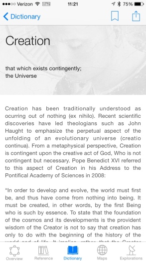
Every term in the Dictionary has a link to a relevant Magisterial document, academic journal article, or other online reference. By far, building this database of over 500 terms took the most amount of time. I spent most of my late evenings this past year, building up bit by bit. Having high quality deep links to journals like Theological Studies is really a nice feature for anyone interested in seeing how the given term is used in the current literature, online, or in official Church teaching.
After condensing the Dictionary into one tab, I had room for 4 more features. I figured that some geographical terms would be better understood on a Map, so I imported MapKit and learned how to create some custom pin annotations, which I grouped into 4 categories: Old Testament, New Testament, Historical, and Social Justice. The pin reveals the name of location as well as a short, one line description of why the site is significant. When a user taps the info button, they are taken to a detail view of the site where they can read more about it and access additional links. I re-used the Dictionary detail view in the Map detail view. I also incorporated relevant quotes from Pope Francis’ latest encyclical, Laudato Si’, in the Social Justice category.
As I thought more about it, I wanted to have one tab that was dedicated to a wide-angle perspective of what Theology was all about. So, the Overview tab has two pages, Sources and Signs. Since this was going to be the default tab when the app opened, I wanted it to be visually distinct from the other tab layouts.
I don’t even remember how many iterations…
…to get to the final version. I again re-used the Dictionary detail view for more information on each Source or Sign.
Any decent study tool should have a Reference section, so I wanted to reserve a tab for a curated list of online websites that would be useful when seeking further information. For every button in the Overview tab, I created a section in a UITableView with a select group of links. These link to a UIWebView that renders the selected reference site.
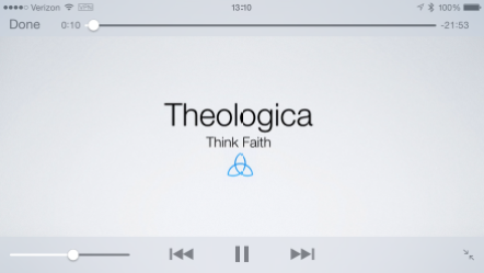
The last tab space was empty, so I thought a nice feature would be to somehow incorporate video into the app. I had created a series of Keynote presentations previously for various parish lectures around the area, so I added a voice over narration and then exported the file to a Vimeo Pro account, where I can stream it to the re-used UIWebView from the Reference tab.
I’ve learned a ton from building this thing. Even though it is written in Objective-C, the larger concepts involved will not drastically change, so I think I’ve got a good start on Swift. I wanted to make something that didn’t exist, something that other people could use to better learn Theology. The ultimate test of how useful a tool it is will be whether or not my students can use it to complete a major assignment and/or successfully study for an exam. I guess that’s been my thinking all along. No, I’m not trying to replace libraries or the downplay the need to develop excellent research skills. Instead, I believe that if an app can be so curated as to be a useful tool for learning, people will recognize and value that. It feels pretty amazing to have actually built it.
I put an incalculable amount of time into making this app. Given its ability to be a “one-stop-shopping” Theology experience for its users and the fact that no ads will ever interrupt that experience, I think that it’s well worth $2.99.
That’s less than trip to Chipotlé.


Absolutely brilliant! Great work Jonathan!
Pingback: Iterative Design: Building Theologica | Mi Registro de la Web